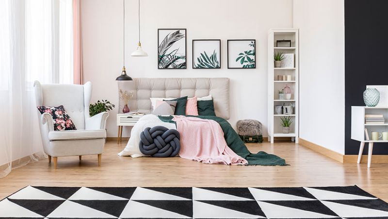
In terms of décor, two schools collide: the trendy, still referred to as "snobs," and the supporters of "everyone does what he pleases." Regardless of which group you belong to, both emphasize an important point when it comes to interior design: decoration faux pas. But it’s not only about outdated accessories and furniture. These errors relate rather to the small shells that we all tend to commit to unintentionally. Too many colours in the same room, too much furniture in a tiny flat, a lousy pattern or design mix... However, regardless of the size, style, or kind of space, there is one mistake that could ruin everything. Here is the one according to our experts!
What is the decoration mistake not to commit again this year?
It's always welcoming and impeccable at their place. Not so much at home! So, what's the matter with your home's decor? Why is it so gloomy? When it comes to décor and interior design in 2022, it's critical to get out on the proper foot. But when we talk about the latter, we immediately think of furniture, materials, colours, and objects. However, there is one more aspect to consider to enhance your space: trendy lighting. While redesigning a space, this is the most significant factor to consider.
Neglecting your home's lighting is therefore the 2022 interior decoration faux pas to be avoided at all costs. Let's make a survey!
The importance of interior lighting in different rooms
In decoration, the question of light is a burden. Finding the right balance between too much and too little light may be difficult. A few design techniques, such as picking the colours of the walls, furniture, and curtains, can help bring light into a gloomy room without a window.
Natural or artificial light, on the other hand, contributes significantly to the ambience of interior spaces. That being said, it's critical to balance your lighting according to the room. The ceiling light and a couple of beautiful accent lights seem like safe options for a gloomy area. To effectively illuminate the house, you must first tame each room. This will help you to see more clearly how to build structure in the space according to light, layout, furniture, decoration, and function.
White light, for example, will create a very modern environment in a living room. Warmer illumination in orange tones, on the other hand, is favoured in the bedroom. However, the process becomes more difficult in the bathroom and kitchen. Despite the traditional belief, extra light sources are required to illuminate the vanity unit or worktop. To summarize, having too much light is preferable to not having enough!
Our tips for properly lighting your home
Certainly, we do not realise how bad lighting can reduce (by an optical effect) the size of a room while devaluing its style. When properly fitted, the appearance of the room changes instantly! In this context, artificial light will have a different effect than natural light on the walls. So, if your room doesn't have enough windows, there are a few tricks to consider to light it up. For example, ceiling lights are perfect for enhancing the dining area, while floor lamps will easily find their place in the living room. In the bedroom, the sconces installed next to the bed bring a chic and dignified look to the most beautiful hotel rooms!
2022 lighting trends to choose from
No surprise, the preference for natural and sustainable materials will continue in 2022, having a direct impact on the upcoming year's popular luminaires. Given that the use of some materials (such as wood, glass, bamboo, fabric, leather, paper, and even seagrass) has already been firmly entrenched in the industry, the following season will also enforce the use of twine, rope, burlap, and wooden beads as a reference. Imagine a chandelier composed of pearls and decorated with cord and stone pendants!
Natural materials are not the only way to embody sustainability and nature in lighting trends. The fixtures will have organic and hazy designs, and they will be ornamented with components that promote nature's delicacy, such as graceful leaf-shaped features, glass tassels that resemble water drops, and so on. Here are the factors to consider in order to implement the 2022 lighting style influenced by nature:
- Natural materials: bamboo, rattan, wood, burlap, rope
- Twigs, flowers, and other flora-inspired organic forms
A few more decoration missteps to avoid in 2022
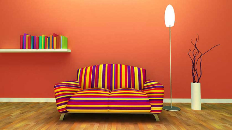
The interior design faux pas is almost often the same as the fashion faux pas! Choosing the proper colour, furniture, or object, and marrying them all in the same space, on the other hand, is a difficult task. If there is one guideline to follow when it comes to interior design, it is to avoid mixing more than two distinct hues in the same space. Only one colour/pattern is acceptable for a harmonious home where living will be nice on a daily basis. This guideline wins every time in both fashion and decorating. When there are too many colours or patterns in a room, it irritates the eyes and overburdens the decor. The same goes for crowding furniture into a small area.
The importance of proportion in decorating cannot be overstated. Combining a large coffee table with a tiny sofa or installing a large closet in a small bedroom is out of the question. Finally, the floor, like the walls, has a significant influence on a room's look. So, when you're redoing your living room or kitchen, it's a good idea to do it all at once. To put it another way, we don't want to associate modern walls with an old-fashioned floor.
